Layout for desktop and mobile display
In the drag & drop editor, you can design a newsletter specifically for display on a mobile phone and desktop. That way, you can make sure your newsletter looks the way you want it to on all devices.
Global design for desktop and mobile display
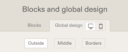
Before adding, editing, or removing blocks to or from a campaign, we recommend that you develop your global design. With that, you can indicate what the default settings for all blocks in your newsletter should be for desktop and mobile display. You can find this option by clicking Blocks and global design → Global design. These options show up in the overview on the left side of the screen when you are editing your newsletter in Step 4.
When you click the Global design tab, you will see three buttons: Outside, Middle, and Borders.

- If you click the screen icon, you will work with the desktop layout. This layout is intended for wider screens. This is your newsletter's default display; the mobile display is derived from this layout.
- If you click the smartphone icon, you will see the mobile display. This is also indicated by the yellow 'Settings for mobile' bar. If you have not yet filled in a colour code or margin, the program uses the settings from desktop display. You cannot change the settings for the borders in mobile display.
Displaying, hiding, and editing blocks for different devices
For each block in your newsletter, you can indicate if and how you want it to show in your newsletter; depending on the reader's screen-width, on a mobile phone and desktop.
To do this, click Design (left side of the screen). You will see two icons:
- If you click the screen icon, you will work with the desktop display, intended for wider screens.
- This is your newsletter's default display; the mobile display is derived from this layout, you can still edit and refine this layout later.
- By default, every block is shown in the in the desktop display. If you do not want a block to show up in this display, scroll down and check the box 'Hide this block on desktop'. The block will then fade (right side of the screen), and it will contain the alert 'This block is hidden'.
- If you click the smartphone icon, you will see the mobile display. This is also indicated by the yellow 'Settings for mobile' bar.
- By default, each block is shown in the mobile display (even the blocks you hid in the desktop display). If you do not want a block to show up in this display, scroll down and check the box 'Hide this block on mobile'. The block will then fade, and it will contain the alert 'This block is hidden'.
- In the mobile display, images are enlarged by default and placed over the full width of the newsletter. Columns are automatically stacked under each other. You can change this in the Design tab for the mobile display, by clicking 'Do not stack, show like on desktop'. In the same tab, you can adjust the width of columns in mobile display.
- Using the the buttons under Design (such as Title, Image, Block, or Exterior), you can see what parts of the design you can change for mobile display. Examples of this are the font, text colour, text size, and outline of titles, texts and link texts, the margins in and around the block, and the (background) colour and borders in and around the block.
- In the mobile display, the preheader is not displayed by default. If you do want it to appear, read here how to change the preheader.
Tip: regularly check your newsletter's Preview, to make sure the display is still how you want it to be.
